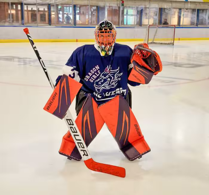
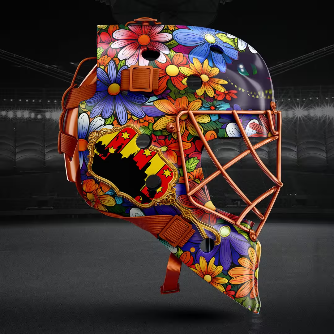
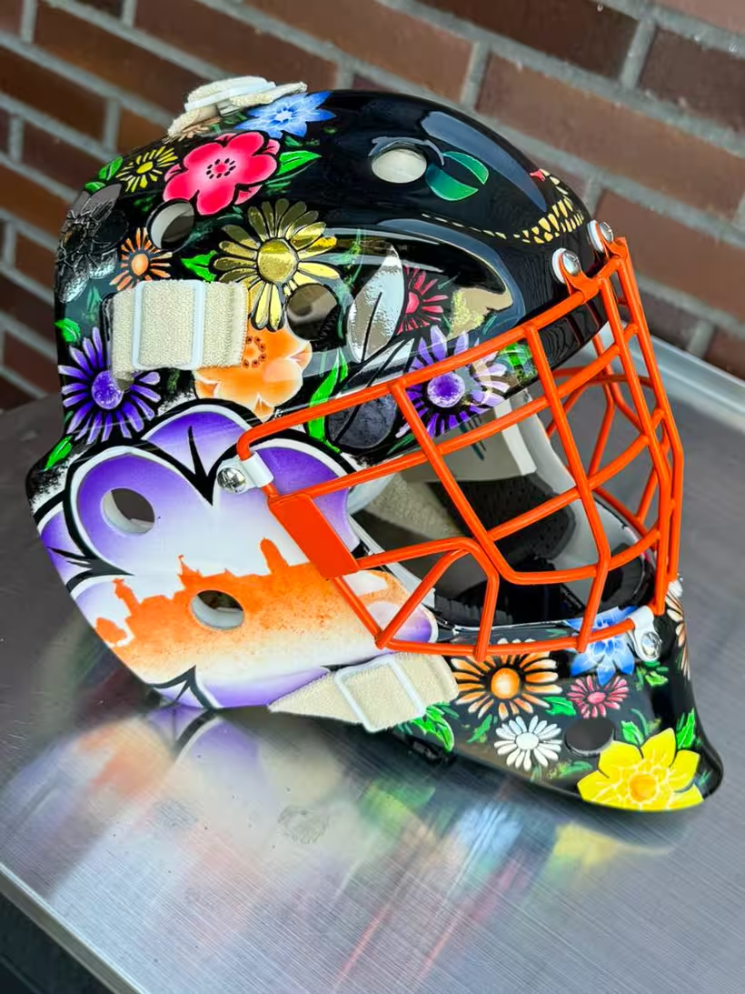
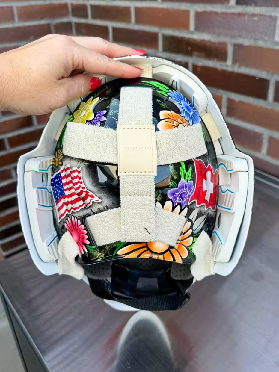
As any hockey goalie will tell you, they’re often considered the oddballs on the ice, and my wife Kelsey embodies this spirit with her laughter and chatter during games, even when her Swiss teammates might struggle with her American English. This summer, it was time for Kelsey to get a new set of gear, which presented the all-important question of what kind of mask design she wanted. After sporting a fierce, orange panther on her previous mask, Kelsey wanted something more playful for her new one. Her requirements were clear: it had to incorporate elements from her two teams—the Engelberg Bösi Büsi and Lucerne Lady Dragons—feature a happy theme with flowers, match her new orange and purple pads, pay homage to Switzerland, the USA, and her current hometown of Rheinfelden, and above all No Pink.
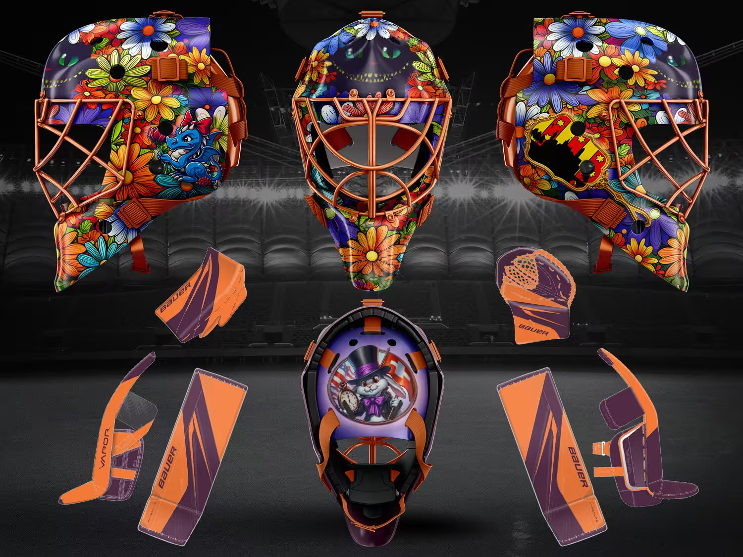
It was time to dust off my Photoshop skills to help sketch the possibilities. A shout-out to Ali and the team at SportTemplates, whose templates made this much faster.
The Creative Process Begins
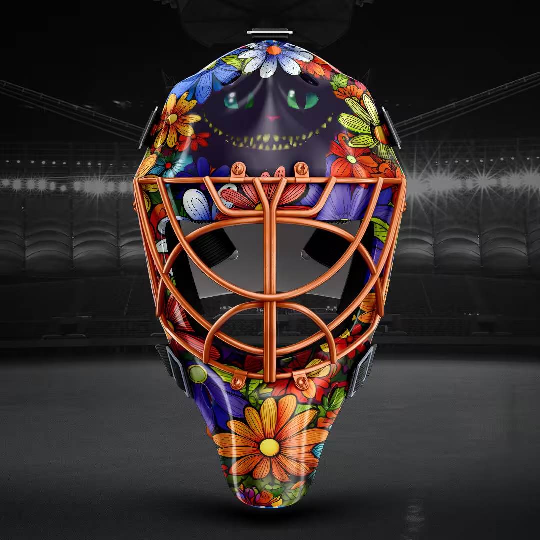
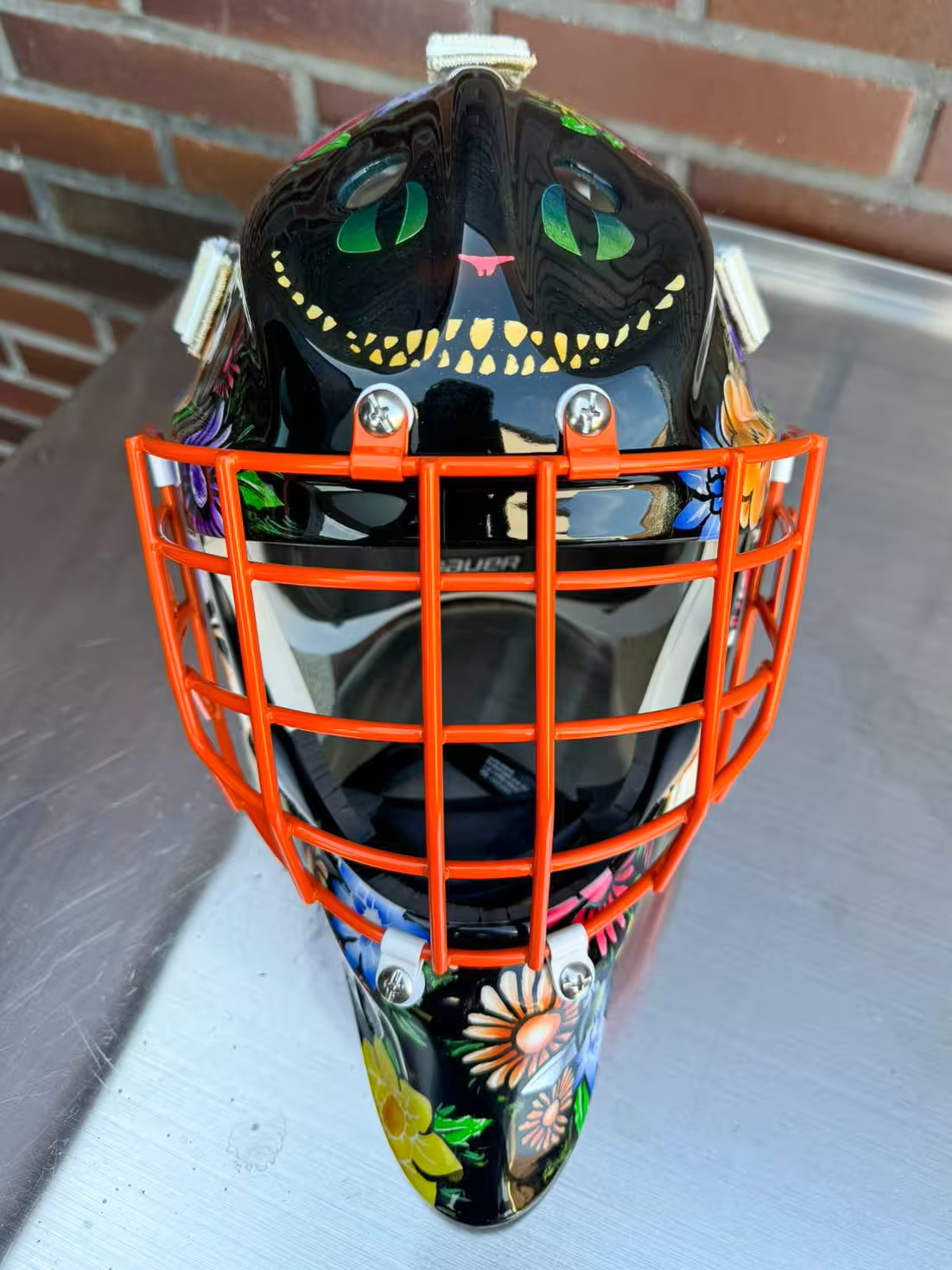
We started by playing with the location of Bösi-Büsi’s Cheshire Cat, as its placement would drive a lot of the design. We tried it on the side, split above and below the grill, and above the grill. Kelsey wanted it on the front, and we agreed it looked best together, not divided by the grill.
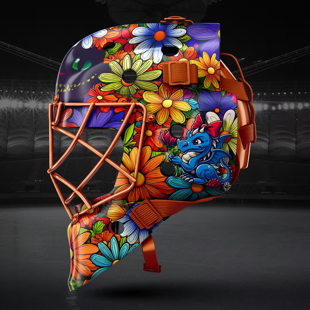
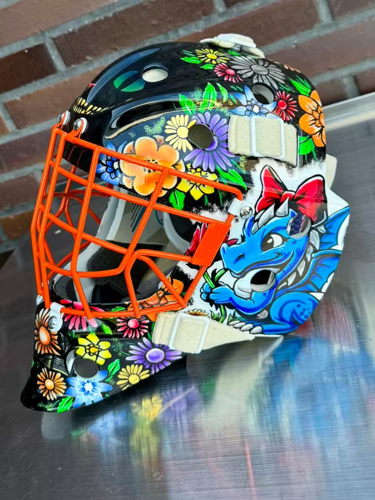
Next, we contemplated the dragon; Kelsey wanted something more playful than the official logo. She wanted to incorporate a dragon representing the team but leaning towards the playful rather than the fierce. Utilizing Dall-E, I created a cartoon dragon wearing a bow amidst flowers, which Kelsey adored for its similarity to the stuffed dragons passed around the Lady Dragons’ locker room for the player of the game. Given the graphic we settled on, it had to go on the side.
“Through the Looking Glass”
Inspired by the whimsical nature of the Cheshire Cat and the dragon (or Jabberwock, given Kelsey’s chatter on the ice) and an American girl finding her way in Switzerland, I became enamored with a “Through the Looking Glass” theme for the mask. This idea was further expanded with the Rheinfelden skyline viewed through a looking glass on one side of the mask. For a fun touch on the backplate, I used Dall-E to design a rabbit in a top hat holding Swiss and American flags, although this element was later removed during the final design phase.
Collaboration with a Professional
After several iterations, Kelsey was happy enough with the sketches to start talking to an artist. She contacted the goalie community for airbrush artist recommendations and chose Airxess in Bern. We drove down to discuss the design with Marco, the artist. Marco suggested simplifying the design by removing the rabbit to prevent the backplate from becoming overly cluttered with too much detail that wouldn’t be appreciated. He enjoyed our direction but wanted to enhance certain elements, like using foil to make the cat’s eyes pop, enlarging the dragon, and spacing out the flowers to make them more distinct. We left the new, shiny, white mask with him and were anxious to see what he would come up with.
The Final Product
A couple of months later, we picked up the finished mask in time for Kelsey’s training weekend to start off the new season. Marco had done a fabulous job, much better than we had imagined. I also think he had fun with a design that is much different than most of the masks he paints. Marco’s expertise brought the designs to life, making each element stand out while maintaining the playful and personalized theme we envisioned.
Kelsey debuted her new mask at practices with Lucerne and Engelberg this past weekend, and all the ladies loved it. The mask reflected her personality and became a wearable art piece that expressed her unique identity on the ice.
Designing this goalie mask was a fantastic journey that blended creativity, personal expression, and professional artistry. It’s more than just protective gear; it’s a testament to Kelsey’s journey as an American hockey player in Switzerland and a celebration of her love for the sport and her teams.

